
Modern, bright and elegant kitchen renovation
This modern kitchen renovation began with a classically styled space that needed to be updated both visually and functionally. The aim of the project was to create a more contemporary, orderly and brighter kitchen while retaining a sense of understated elegance and avoiding solutions that felt overly cold or impersonal.
The project completely renewed the cabinetry and finishes, reorganised the storage and introduced a small dining area adapted to the available dimensions. The result is a balanced space with a contemporary appearance and a layout designed to make the most of every centimetre.
From a classic kitchen to a contemporary design
The starting point was a classic kitchen that no longer reflected the client’s aesthetic preferences. The aim was to create a cleaner, more contemporary look while preserving a sense of warmth and sophistication.
To achieve this, simple white fronts without ornamental detailing were combined with stone-inspired surfaces, wooden accents and metal finishes. This selection modernises the space without relying on overly strong contrasts.
The new scheme is based on a neutral palette of whites, creams and sand tones. The wood used in the flooring, chairs and selected decorative accessories adds balance and prevents the space from feeling overly uniform.
A wall of integrated floor-to-ceiling storage
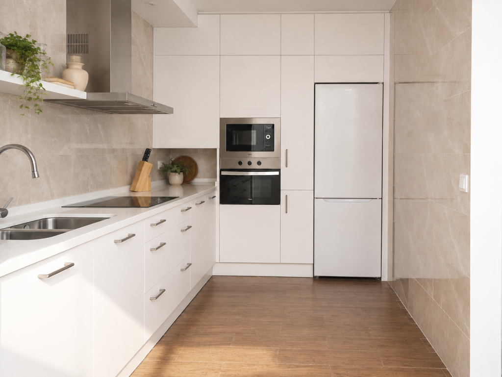
One of the project’s main decisions was to concentrate the largest elements along a single wall of floor-to-ceiling cabinetry.
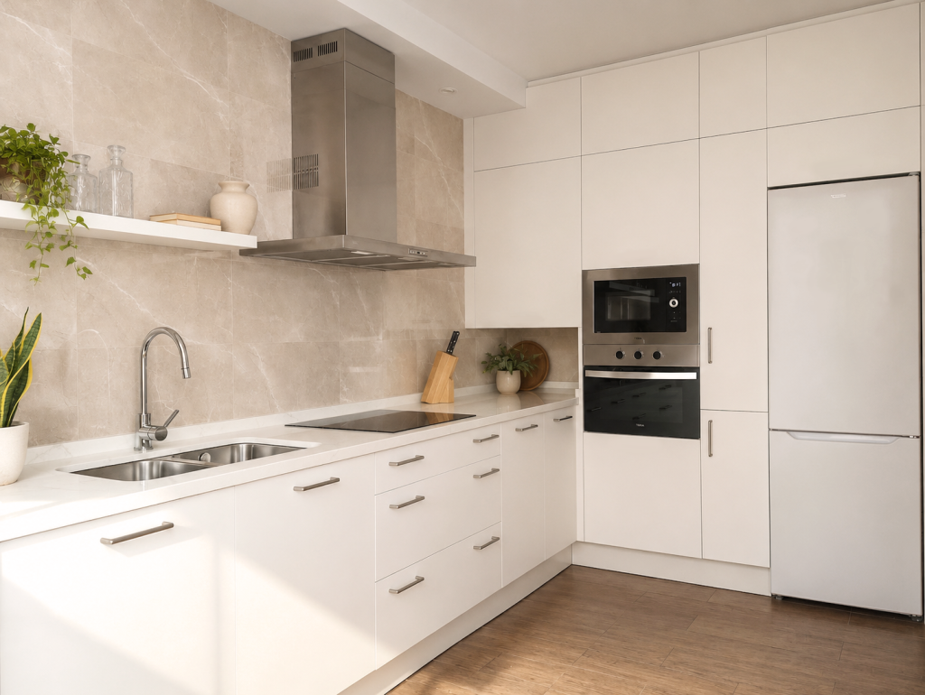
This wall integrates the fridge, the oven and microwave tower, and various storage units. The composition makes use of the full available height and reduces the visual impact of the appliances, allowing them to become part of a continuous and orderly structure.
This solution significantly increases storage capacity without overloading the working area. It also simplifies the visual reading of the space by grouping the vertical functions along a single plane.
The cabinetry follows a clean modular design, with almost completely plain fronts and discreet handles. The result conveys continuity and makes the kitchen feel more organised.
An open and visually light working area
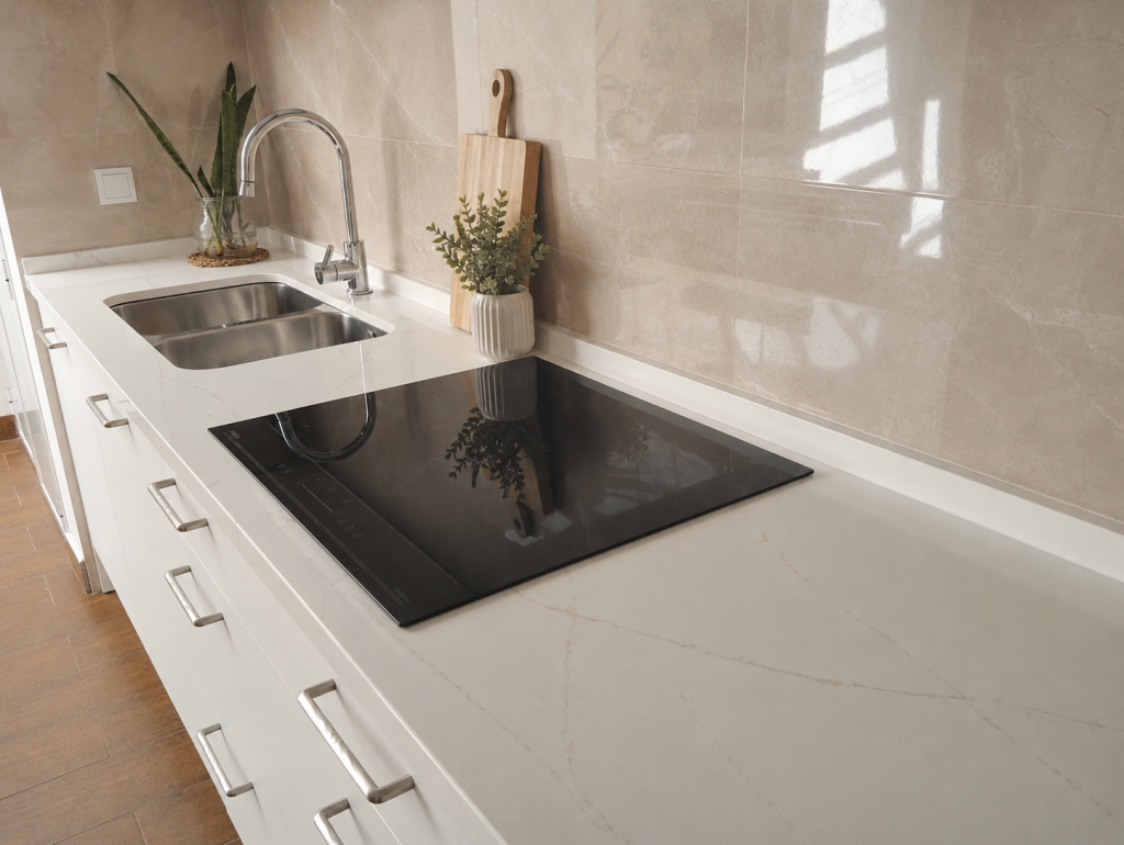
On the opposite wall, only base units were retained. The absence of wall units frees the visual plane, increases the perceived sense of space and allows the finish to take on greater prominence.
This decision is particularly suitable for a kitchen of modest proportions. By keeping the upper section clear, the room gains depth and natural light can spread more easily.
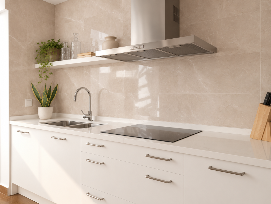
The white worktop extends this sense of continuity. A Neolith surface inspired by Calacatta marble has been used, with delicate veining that adds elegance without competing with the other elements.
The sink and hob are arranged along this surface, maintaining a continuous and functional worktop.
Marble effect as a unifying thread
Renewing the wall tiles was essential to transforming the appearance of the kitchen.
The marble-effect finish covers much of the wall area and acts as a common backdrop for the entire composition. Its beige tones and soft veining introduce texture and depth while maintaining a bright appearance that is easy to coordinate.
Rather than concealing it behind a continuous run of wall units, it was left visible in the main area. In this way, the finish becomes more than a functional surface and turns into one of the project’s most important decorative features.
The combination of the pale worktop and the wall finish creates a smooth transition between horizontal and vertical surfaces, reinforcing the sense of order.
Stainless-steel cooker hood and decorative shelf
The stainless-steel cooker hood introduces a contemporary accent against the stone-effect backdrop. Its clean, visible design creates a balanced contrast with the soft colour palette.
A simple white shelf was installed beside it. This element allows plants, ceramics, books and glass objects to be displayed without taking up too much wall space.
As well as adding a more domestic and welcoming touch, the shelf visually balances the technical presence of the cooker hood. The decoration remains restrained to preserve the sense of space and avoid an overly busy composition.
A small dining area integrated into the corner
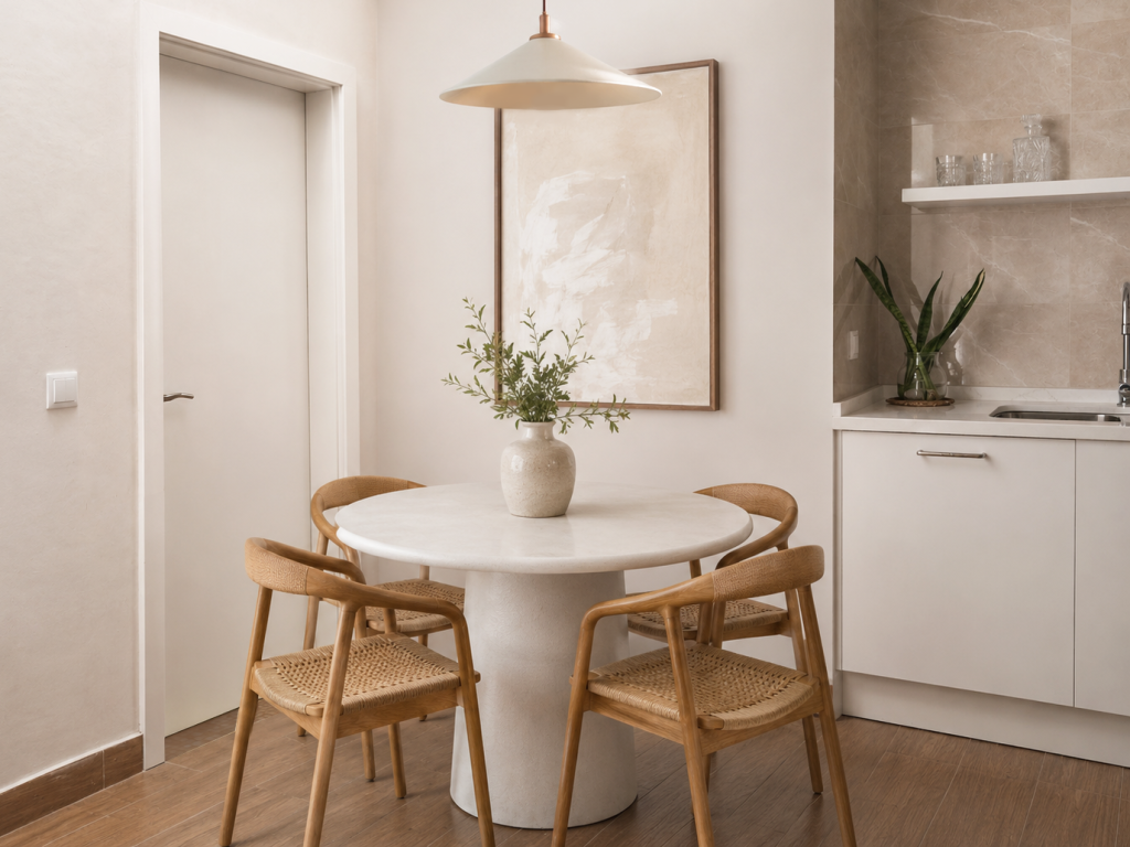
The dimensions of the room required a compact dining area that would not obstruct movement or interfere with the kitchen’s functionality.
A small round table was chosen to improve circulation within the limited space. Its shape accommodates several chairs without creating awkward corners and results in a more welcoming composition.
The wooden chairs with woven seats add texture and warmth. Above the table, a pendant light visually defines the dining area and creates a distinct focal point.
The composition is completed with neutral-toned artwork and a vase with green branches. These elements connect the dining corner with the materials and colours used in the kitchen.
A modern kitchen renovation based on balance
The final result combines generous storage capacity, visual openness and a warm contemporary aesthetic.
Concentrating the tall units along a single wall frees the main area, while the pale materials enhance the sense of light. Wooden details, plants and decorative elements prevent the kitchen from losing its domestic character.
The project demonstrates how a classic kitchen can be updated without resorting to an overly dramatic transformation. Through a more rational layout, a coherent selection of materials and careful attention to proportion, María Vélez has created a contemporary, functional space designed for everyday use.
Project summary
Renovation of a classic kitchen transformed into a contemporary, bright and elegant space. The new design concentrates storage along a wall of floor-to-ceiling cabinetry and frees the working area to highlight the marble-effect finish. A small dining area completes a functional, warm and balanced interior.
Are you thinking about updating your kitchen? Discover how a bespoke interior design project can transform its layout, functionality and atmosphere.